It used to be thought that choosing a rental meant losing the opportunity to customize your exhibit presence to your brand image and message. Not anymore. With the proper use of lighting, graphics and quality rental components, your exhibit brings your brand to life while providing your budget cost savings that will leave your team in awe.
Think big and think differently
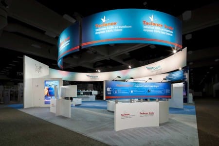
Look at ways to reconfigure and leverage your rental components in new and unexpected ways. System components in particular can be easily reconfigured and repurposed due to their inherent properties. Remember even though elements may have originally been utilized one way, that doesn’t always mean they can’t be manipulated another. Don’t just look down at the floor plan, look up! At the American Academy of Dermatology’s Annual Meeting, a large curved banner spanned the length of LEO Pharma’s 20 x 50-foot medical affairs booth. The banner acted as a beacon that attracted attendees from across the show hall, helping the pharmaceutical company attain its goal of creating greater visibility.
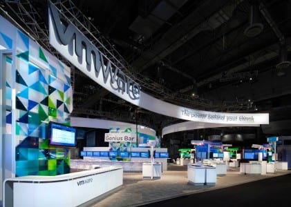
System components don’t have to scream rental, utilizing these components as the structure and skinning them in various materials can create a custom look for less. Layering materials, mixing textures and finishes can have a similar effect. Custom touches such as materials that match the client’s PMS colors, CNC or laser cut patterns and embedded technology are other simple ways to create a custom look. MG Design’s exhibit design team infused personality into VMware’s rental unit by incorporating corporate colors and dimensional curves inspired by VMware’s marketing materials and website; creating an eye-catching and cost-effective exhibit that resonated with their brand objectives. VMware was so pleased with this 80 x 90-foot rental booth that the design was emulated for another event following it, which is another benefit easily accomplished using rental.
Lighting is key
Good lighting elevates the look and feel of every exhibit. The simplest design with a good lighting package can outshine a more expensive exhibit without proper lighting. Adding subtle lighting effects, color and motion in key areas within a booth further the experience.
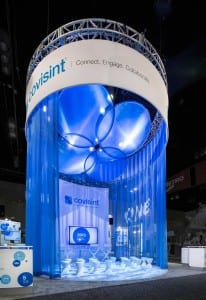
Covisint used lighting accents to build an attendee engagement with their visually stunning, 30 x 40-foot booth, which brought the Covisint brand to life. The circular, 20-foot diameter Connection Zone provided the ability to connect, engage and collaborate on a number of levels and was reconfigurable into presentation, performance and café modes to adapt to changing needs during the course of the show.
Mixing flooring, textures, patterns, finishes and double carpet padding are more ways to add a luxury feel without adding cost.
Less is more
Simple structures, proper proportions and focused floor plans elevate the booth experience. These are details that are more often felt than seen. A successful booth is one that immediately sets attendees’ expectations and clearly points them in the right direction in a comfortable manner. This mantra can be very useful in designing a rental booth. A good parallel can be found in high-end retail environments. They often use simple styling, a mix of key materials and minimal/focused product displays to create a comfortable environment that draws potential buyers to specific products.
Your target audience will base their first impression of you on your impact on the show floor and the message you are conveying. With a great rental design, you can wow your prospects, your sales team and your budget.
Dan Cieciwa is a senior designer at MG Design who enjoys the variety of the clients and industries he gets to work with every day.


