 Company: Fabric Images, Inc.
Website: www.FabricImages.com
E-mail: Info@FabricImages.com
Description: Fabric Images is a fabricator and designer of printed fabric structures for interior retail, exhibit and event communities.
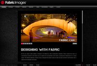
The newly redesigned Fabric Images Web site definitely knows how to make an entrance. As the homepage opens, music comes streaming through your speakers and the menu and main image frames come flying onto the screen. As the music continues, six very distinct examples of their fabric architecture rotate on the screen, giving the visitor a quick demonstration of their capabilities.
“We needed a refreshed look and a new online experience,” said Leo Boczar, director of communications for Fabric Images, Inc. “We also wanted to improve our brand’s look and feel to create reliability for our current clients and future prospects.”
Based on the design of the Web site, it is easy to see that Fabric Images designs and builds products for a visual world. The site is filled with examples of their fabric architecture in the Portfolio tab of the menu. The Gallery tab also contains examples from their indoor and outdoor designs categories. Other categories include Detail, Groove and Up High, just to name a few.
“We made our portfolio, gallery and other sections heavily imaged-based,” said Boczar. “The images allow our staff to tell stories based on specific solutions or scenarios. Our text speaks to our philosophy that materials and design are the true benefit for utilizing fabric architecture.
“Our site was primarily designed as a tool that our sales force could utilize for presentations,” Boczar said. “We also wanted to educate designers and architects about printed tensioned fabric architecture.”
The redesign does contain a few obstacles that unaccompanied viewers must overcome though.
The site is best viewed when the user puts their browser in full screen mode. Otherwise, some of the text accompanying the images is hidden off the screen. The site recognizes this by placing a “full screen” button in the bottom right hand corner of the page.
Placing additional text on the homepage, as it loads, that recommends visitors view the site in full screen mode would definitely be a plus for the site.
The base URL (www.fabricimages.com) also requires Flash and Shockwave viewers to see the site. In the past, this was looked at as a bad idea because it prevented some computers from retrieving the page. Users must have the Flash and Shockwave viewers/plug-ins installed on their machines to view the site. This is becoming less and less of an issue, as Web design software companies have made their plug-ins easily accessible.
The visually-oriented target audience of the site is another reason this type of design is a reward and not a risk.
“Architects, exhibit and event designers, museum designers, interior designers and environmental graphic designers are just some examples of our intended audience,” said Bozcar. “We are trying to inspire them to try new things and reach outside their design box to find interesting ways to incorporate textiles with traditional materials.”
One feature that can be a drawback to the traffic of the site is the use of frames in the design. Frames prevent bookmarking individual pages because the user’s URL does not change when they navigate through the site. For example, if a client were to try and bookmark the Organic design section under the Gallery tab, the bookmark would just bring the visitor back to www.fabricimages.com, making them navigate the rest of the way each time they visit.
The use of frames also hinders search engine optimization since the entire site is contained within one URL. Other pages, like the About Us section, have no distinct address for search engines to find.
These limitations would be a disaster for the Web site of an organization like the New York Times. Imagine not being able to forward a link to a friend about a specific article or bookmark a certain news section on that site.
In this case, however, when a Web site is heavily visited by industry specific professionals, FabricImages.com does not really suffer from a lack of exposure because their niche is so well defined.
“Most other industries outside the world of exhibit and event design are not really concerned with the obvious strengths of fabric architecture – like drayage, storage, installation, etc.,” said Bozcar. “Our site is designed to facilitate a conversation and dialogue between us and potential or current business partners. We also promote our clients’ design savvy. There are many people that under utilize the design aspects of fabric architecture. We wanted to show that there are really great designers that use this medium.”
Quick Hits
I’ll link to that:
Alta Vista has a tool that identifies sites that link to a specific webpage or base URL. According to the site, FabricImages.com has 168 external websites that link to their page.
To-Do list:
w Register www.fabricimage.com and create a redirect to www.fabricimages.com.
w Create redirects from URL’s associated with the previous version of the Web site. Ex.: www.fabricimages.com/aboutus.html and www.fabricimages.com/contact.html.
w To increase your search engine rankings, submit your site to DMOZ and Yahoo online directories. DMOZ powers the search directory services for Netscape, AOL, Google, Lycos, HotBot, DirectHit and other search engines.
|
Keyword search performance: |
|||
|
Search Engine Rankings |
|||
|
Keywords |
|
Yahoo |
Bing |
|
Fabric Images |
1 |
1 |
1 |
|
Image Fabrics |
9 |
2 |
29 |
|
Fabric Image Architecture |
3 |
5 |
8 |
|
Tensile Fabric Architecture |
7 |
5 |
>100 |
|
Fabric Images Tradeshow |
2 |
1 |
>100 |
|
Tension Fabric Structures |
>100 |
58 |
30 |
|
Fabric Structure |
>100 |
54 |
>100 |
Final thought:
“The world of tension fabrics is still relatively new and the potential for alternative application is still on the rise, so push us to the limit,” requested Boczar.


