Acer Exhibits & Events, a veteran-owned company specializing in the design and fabrication of custom tradeshow exhibits, recently re-branded its visual brand elements.
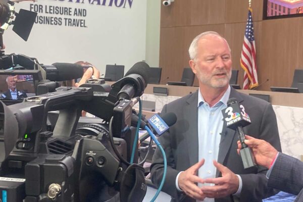
 Mark Crane (pictured left), CEO of Acer Exhibits & Events, launched the new branding to employees during a picnic, saying: “For the last 18 years, we have been hyper-focused on our clients’ brands, ensuring that we present them in the best light. As we bounce back from the recent industry downturn, it is time to evolve our own Acer brand. Although our look may have changed, we keep our mission to IGNITE BRAND PRIDE, and we are doubling down on our promise to make exhibiting ‘Acer Easy’ for our clients.”
Every element of the new branding platform was intentionally chosen to underscore the mission of the award-winning exhibit house. The color palette includes modern cool grays and a light orange accent color. Orange imparts feelings of excitement, enthusiasm and energy, which attract attention. Because generating excitement, enthusiasm and energy for brands in an attention-getting way is the very core of what Acer does, there was no other color to use for the new branding.
The logo looks simple at first glance; however, a complex lettering style hints that there is more beneath the surface. This reflects the dedication of the Acer staff to work tirelessly behind the scenes, while the client enjoys an easy experience.
 Recognizing exceptional service as the hallmark of Acer’s offering, Acer president Michael Dunne (pictured right) says, “We will not lose focus on our core competency of client-centric exhibit design and build. The last 18 months have been trying to say the least. It is gratifying to know we got through it and are back to doing what we do best for our clients. Our new branding provides an opportunity to show that we are better than ever!”


